D.8 KSL Plotting Utilities
This file demonstrates how to create many of the plots that are available within the ksl.utilities.io.plotting package. The KSL uses the lets-plot library as its underlying plotting platform.
The KSL wraps the lets-plot functionality into a set of classes to create commonly used plots within simulation. The KSL has classes that facilitate the construction of the following plots.
ACFPlot- The autocorrelation function (ACF) for an array of data plots the correlation between \(X_i\) and \(X_{i+k}\) for different values of \(k\).BoxPlot- The box plot summary for an array of data plots the summary statistics representing the first quartile, median, and third quartile of the data along with outliers.MultiBoxPlotA multi-box plot presents multiple box plots on the same plotting frame.CDFDiffPlot- CDF difference plot, as defined in Chapter 6 of (Law 2007), plots the difference between the theoretical distribution \(F(x)\) and the empirical distribution \(F_n(x)\) over the range of the data.ConfidenceIntervalsPlot- A confidence intervals plot presents a set of confidence interval on one plotting frame.DensityPlot- A density plot presents the density of the data relative to a possible probability distribution.DiscreteCDFPlot- A discrete CDF plot presents the cumulative distribution function for a discrete empirical random variable with a step-function representation.DotPlot- A dot plot present the distribution of the data as a sequence of dots.ECDFPlot- An empirical CDF plot presents the distribution of the data as a cumulative estimate of the CDF.FitDistPlot- A fit distribution plot presents four plots (ECDFPlot, PPPlot, QQPlot, HistogramPlot) of data for distribution fitting diagnostics.FunctionPlot- A function plot facilitates the plotting of a univariate function.HistogramPlot- A histogram plot summarizes the distribution of the data over well-defined bins.HistogramDensityPlot- A histogram plot summarizes the distribution of the data over well-defined bins and super imposes a density representation over the histogram.IntegerFrequencyPlot- An integer frequency plot presents a bar graph representation of integer frequency tabulated data.StateFrequencyPlot- A state frequency plot presents a bar graph representation of integer frequency data tabulated across state observations.ObservationsPlot- An observations plot presents a time-ordered plot of the data.PMFComparisonsPlot- A PMF comparison plot presents plots the theoretical PMF versus an empirical PMF.PMFPlot- A PMF plot presents a dot bar graph representation of a probability mass function.PPPlot- A P-P plot presents the model probability \(\hat{F}(x_{(i)})\) versus the empirical probability \(\tilde{F}_n (x_{(i)})\) based on the sample for i= 1, 2,\(\ldots\) nQQPlotA Q-Q plot presents the order statistics versus the theoretical order statistics, \(x_{q_i}\) versus \(x_{(i)}\) for i = 1, 2, \(\ldots\) n.ScatterPlot- A scatter plot is a simple x-y plot of two data arrays.StateVariablePlot- A state variable plot presents a step-function representation for time-persistent variables as per Figure 4.4.WelchPlot- A Welch plot presents the cumulative sum plot of Welch data as illustrate in Figure 5.15.PartialSumsPlot- A partial sums plot presents the partial sums process for diagnosing whether initialization bias is present.
In what follows, we present some example code for creating a few of these plots. The full code can be found in the files associated with this appendix.
In the following code, a bivariate normal random variable is created and a sample array is made containing the \(X\) and \(Y\) data. Then a scatter plot is made from the data.
    val bvn = BivariateNormalRV(0.0, 1.0, 0.0, 1.0, 0.8)
    val data = bvn.sampleByColumn(1000)
    val plot = ScatterPlot(data[0], data[1])
    plot.showInBrowser(plotTitle =  "Scatter Plot of Bivariate Normal RV")
    plot.saveToFile("ScatterPlotDemo", plotTitle = "Scatter Plot of Bivariate Normal RV")
Figure D.15 presents the plot as generated by the saveToFile() function.
Figure D.15: Example Scatter Plot
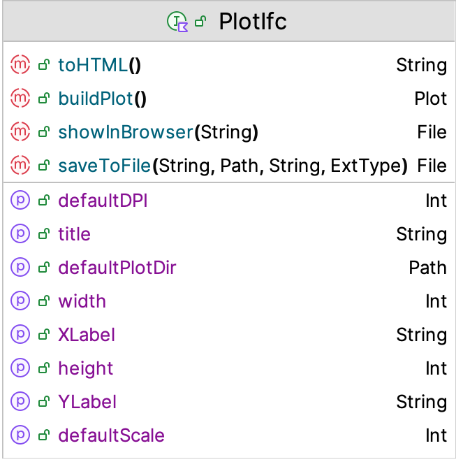
The returned plot variable implements the PlotIfc interface. The PlotIfc interface is shown in Figure D.16. The function buildPlot() returns an instance of the Plot class from the lets-plot library. This instance can be further customized using the concepts of that library. The toHTML() function generates an HTML file that can be opened by a browser. This is what the showInBrowser() function does.

Figure D.16: PlotIfc Interface
The following code illustrates how to display multiple box plots.
    val n = NormalRV()
    val m = mutableMapOf<String, BoxPlotSummary>()
    for (i in 1..5) {
        val bps = BoxPlotSummary(n.sample(200), "BPS$i")
        m[bps.name] = bps
    }
    val plot = MultiBoxPlot(m)
    plot.showInBrowser(plotTitle =  "Box Plots")
    plot.saveToFile("BoxPlotDemo", plotTitle = "Box Plots")
The code makes a map of BoxPlot instances indexed by their names and then displays them together on a single plot axis.
Figure D.17: Example Multiple Box Plots
The following code illustrates how to display multiple confidence intervals on the same plot.
    val n = NormalRV()
    val m = mutableMapOf<String, Interval>()
    for (i in 1..5) {
        val s = Statistic(n.sample(200))
        m[s.name] = s.confidenceInterval
    }
    val plot = ConfidenceIntervalsPlot(m, referencePoint = 0.0)
    plot.showInBrowser(plotTitle = "Confidence Intervals")
    plot.saveToFile("ConfidenceIntervalsPlot", plotTitle = "Confidence Intervals")
The code makes a map of Interval instances indexed by the names of their associated statistics and then displays them together on a single plot axis.
Figure D.18: Example Multiple Confidence Interval Plots
Finally, the following code illustrates how to create a state variable plot. In this case, two arrays are required. The first arrays hold the times at which the state variable changes. The second array holds the value of the state variable for the associated times.
    val t = doubleArrayOf(0.0, 2.0, 5.0, 11.0, 14.0, 17.0, 22.0, 26.0, 28.0, 31.0, 35.0, 36.0)
    val n = doubleArrayOf(0.0, 1.0, 0.0, 1.0, 2.0, 3.0, 4.0, 3.0, 2.0, 1.0, 0.0, 0.0)
    val plot = StateVariablePlot(n, t, "Response")
    plot.showInBrowser()
    plot.saveToFile("StateVariableDemo", plotTitle = "State Variable Plot")
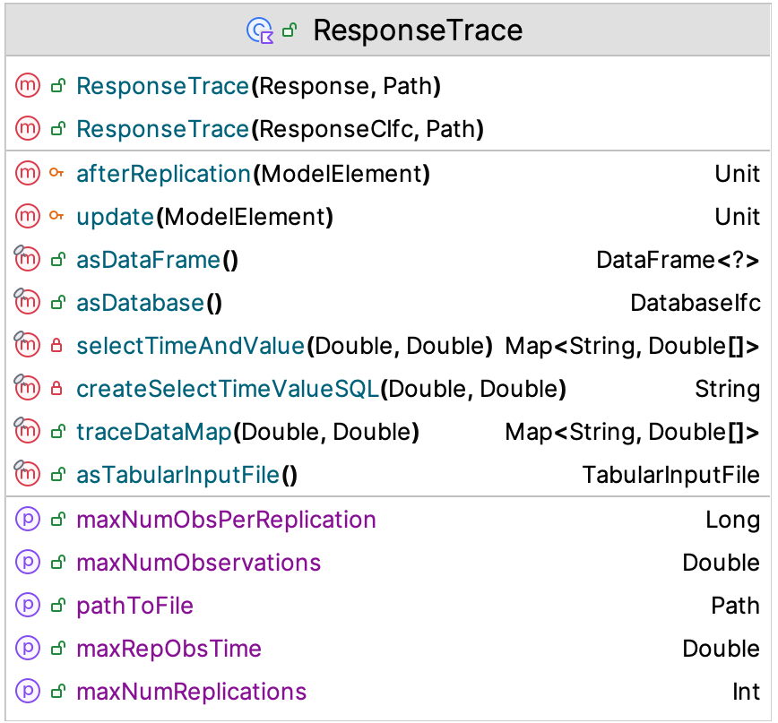
Figure D.19: ResponseTrace Class
Section 5.4.1 of Chapter 5 presented how to make a ResponseTrace of a variable from a simulation model. In reviewing, Figure D.19, we see that the traceDataMap() function will allow you to grab the data for a state variable plot. The function returns a map that has the time and values for the variable for a particular replication less than or equal to the provided time value.
Thus, you can easily create a state variable plot for a response trace when needed.
Figure D.20: Example State Variable Plot