B.5 Fitting Continuous Distributions
Previously, we examined the modeling of discrete distributions. In this section, we will look at modeling a continuous distribution using the functionality available in R. This example starts with step 3 of the input modeling process. That is, the data has already been collected. Additional discussion of this topic can be found in Chapter 6 of (Law 2007).
| 1 | 2 | 3 | 4 | 5 | 6 | 7 | 8 | 9 | 10 | |
|---|---|---|---|---|---|---|---|---|---|---|
| 1 | 15.3 | 10.0 | 12.6 | 19.7 | 9.4 | 11.7 | 22.6 | 13.8 | 15.8 | 17.2 |
| 2 | 12.4 | 3.0 | 6.3 | 7.8 | 1.3 | 8.9 | 10.2 | 5.4 | 5.7 | 28.9 |
| 3 | 16.5 | 15.6 | 13.4 | 12.0 | 8.2 | 12.4 | 6.6 | 19.7 | 13.7 | 17.2 |
| 4 | 3.8 | 9.1 | 27.0 | 9.7 | 2.3 | 9.6 | 8.3 | 8.6 | 14.8 | 11.1 |
| 5 | 19.5 | 5.3 | 25.1 | 13.5 | 24.7 | 9.7 | 21.0 | 3.9 | 6.2 | 10.9 |
| 6 | 7.0 | 10.5 | 16.1 | 5.2 | 23.0 | 16.0 | 11.3 | 7.2 | 8.9 | 7.8 |
| 7 | 20.1 | 17.8 | 14.4 | 8.4 | 12.1 | 3.6 | 10.9 | 19.6 | 14.1 | 16.1 |
| 8 | 11.8 | 9.2 | 31.4 | 16.4 | 5.1 | 20.7 | 14.7 | 22.5 | 22.1 | 22.7 |
| 9 | 22.8 | 17.7 | 25.6 | 10.1 | 8.2 | 24.4 | 30.8 | 8.9 | 8.1 | 12.9 |
| 10 | 9.8 | 5.5 | 7.4 | 31.5 | 29.1 | 8.9 | 10.3 | 8.0 | 10.9 | 6.2 |
B.5.1 Visualizing the Data
The first steps are to visualize the data and check for independence. This can be readily accomplished using the hist, plot, and acf functions in R. Assume that the data is in a file called, taskTimes.txt within the R working directory.
y = scan(file="data/AppDistFitting/taskTimes.txt")
hist(y, main="Task Times", xlab = "minutes")
plot(y,type="b",main="Task Times", ylab = "minutes", xlab = "Observation#")
acf(y, main = "ACF Plot for Task Times")
Figure B.11: Histogram of Computer Repair Task Times
As can be seen in Figure B.11, the histogram is slightly right skewed.

Figure B.12: Time Series Plot of Computer Repair Task Times
The time series plot, Figure B.12, illustrates no significant pattern (e.g. trends, etc.).

Figure B.13: ACF Plot of Computer Repair Task Times
Finally, the autocorrelation plot, Figure B.13, shows no significant correlation (the early lags are well within the confidence band) with respect to observation number.
Based on the visual analysis, we can conclude that the task times are likely to be independent and identically distributed.
B.5.2 Statistically Summarize the Data
An analysis of the statistical properties of the task times can be easily accomplished in R using the summary, mean, var, sd, and t.test functions. The summary command summarizes the distributional properties in terms of the minimum, maximum, median, and 1st and 3rd quartiles of the data.
summary(y)## Min. 1st Qu. Median Mean 3rd Qu. Max.
## 1.300 8.275 11.750 13.412 17.325 31.500The mean, var, sd commands compute the sample average, sample variance, and sample standard deviation of the data.
mean(y)## [1] 13.412var(y)## [1] 50.44895sd(y)## [1] 7.102742Finally, the t.test command can be used to form a 95% confidence interval on the mean and test if the true mean is significantly different from zero.
t.test(y)##
## One Sample t-test
##
## data: y
## t = 18.883, df = 99, p-value < 2.2e-16
## alternative hypothesis: true mean is not equal to 0
## 95 percent confidence interval:
## 12.00266 14.82134
## sample estimates:
## mean of x
## 13.412The descdist command of the fitdistrplus package will also provide a description of the distribution’s properties.
descdist(y, graph=FALSE)## summary statistics
## ------
## min: 1.3 max: 31.5
## median: 11.75
## mean: 13.412
## estimated sd: 7.102742
## estimated skewness: 0.7433715
## estimated kurtosis: 2.905865The median is less than the mean and the skewness is less than 1.0. This confirms the visual conclusion that the data is slightly skewed to the right. Before continuing with the analysis, let’s recap what has been learned so far:
The data appears to be stationary. This conclusion is based on the time series plot where no discernible trend with respect to time is found in the data.
The data appears to be independent. This conclusion is from the autocorrelation plot.
The distribution of the data is positively (right) skewed and unimodal. This conclusion is based on the histogram and from the statistical summary.
B.5.3 Hypothesizing and Testing a Distribution
The next steps involve the model fitting processes of hypothesizing distributions, estimating the parameters, and checking for goodness of fit. Distributions such as the gamma, Weibull, and lognormal should be candidates for this situation based on the histogram. We will perform the analysis for the gamma distribution ‘by hand’ so that you can develop an understanding of the process. Then, the fitdistrplus package will be illustrated.
Here is what we are going to do:
Perform a chi-squared goodness of fit test.
Perform a K-S goodness of fit test.
Examine the P-P and Q-Q plots.
Recall that the Chi-Square Test divides the range of the data, \((x_1, x_2, \dots, x_n)\), into, \(k\), intervals and tests if the number of observations that fall in each interval is close the expected number that should fall in the interval given the hypothesized distribution is the correct model.
Since a histogram tabulates the necessary counts for the intervals it is useful to begin the analysis by developing a histogram. Let \(b_{0}, b_{1}, \cdots, b_{k}\) be the breakpoints (end points) of the class intervals such that \(\left(b_{0}, b_{1} \right], \left(b_{1}, b_{2} \right], \cdots, \left(b_{k-1}, b_{k} \right]\) form \(k\) disjoint and adjacent intervals. The intervals do not have to be of equal width. Also, \(b_{0}\) can be equal to \(-\infty\) resulting in interval \(\left(-\infty, b_{1} \right]\) and \(b_{k}\) can be equal to \(+\infty\) resulting in interval \(\left(b_{k-1}, +\infty \right)\). Define \(\Delta b_j = b_{j} - b_{j-1}\) and if all the intervals have the same width (except perhaps for the end intervals), \(\Delta b = \Delta b_j\).
To count the number of observations that fall in each interval, define the following function:
\[\begin{equation} c(\vec{x}\leq b) = \#\lbrace x_i \leq b \rbrace \; i=1,\ldots,n \tag{B.8} \end{equation}\]
\(c(\vec{x}\leq b)\) counts the number of observations less than or equal to \(x\). Let \(c_{j}\) be the observed count of the \(x\) values contained in the \(j^{th}\) interval \(\left(b_{j-1}, b_{j} \right]\). Then, we can determine \(c_{j}\) via the following equation:
\[\begin{equation} c_{j} = c(\vec{x}\leq b_{j}) - c(\vec{x}\leq b_{j-1}) \tag{B.9} \end{equation}\]
Define \(h_j = c_j/n\) as the relative frequency for the \(j^{th}\) interval. Note that \(\sum\nolimits_{j=1}^{k} h_{j} = 1\). A plot of the cumulative relative frequency, \(\sum\nolimits_{i=1}^{j} h_{i}\), for each \(j\) is called a cumulative distribution plot. A plot of \(h_j\) should resemble the true probability distribution in shape because according to the mean value theorem of calculus.
\[p_j = P\{b_{j-1} \leq X \leq b_{j}\} = \int\limits_{b_{j-1}}^{b_{j}} f(x) \mathrm{d}x = \Delta b \times f(y) \; \text{for} \; y \in \left(b_{j-1}, b_{j} \right)\]
Therefore, since \(h_j\) is an estimate for \(p_j\), the shape of the distribution should be proportional to the relative frequency, i.e. \(h_j \approx \Delta b \times f(y)\).
The number of intervals is a key decision parameter and will affect the visual quality of the histogram and ultimately the chi-squared test statistic calculations that are based on the tabulated counts from the histogram. In general, the visual display of the histogram is highly dependent upon the number of class intervals. If the widths of the intervals are too small, the histogram will tend to have a ragged shape. If the width of the intervals are too large, the resulting histogram will be very block like. Two common rules for setting the number of interval are:
Square root rule, choose the number of intervals, \(k = \sqrt{n}\).
Sturges rule, choose the number of intervals, \(k = \lfloor 1 + \log_{2}(n) \rfloor\).
A frequency diagram in R is very simple by using the hist() function. The hist() function provides the frequency version of histogram and hist(x, freq=F) provides the density version of the histogram. The hist() function will automatically determine breakpoints using the Sturges rule as its default. You can also provide your own breakpoints in a vector. The hist() function will automatically compute the counts associated with the intervals.
# make histogram with no plot
h = hist(y, plot = FALSE)
# show the histogram object components
h
## $breaks
## [1] 0 5 10 15 20 25 30 35
##
## $counts
## [1] 6 34 25 16 11 5 3
##
## $density
## [1] 0.012 0.068 0.050 0.032 0.022 0.010 0.006
##
## $mids
## [1] 2.5 7.5 12.5 17.5 22.5 27.5 32.5
##
## $xname
## [1] "y"
##
## $equidist
## [1] TRUE
##
## attr(,"class")
## [1] "histogram"Notice how the hist command returns a result object. In the example, the result object is assigned to the variable \(h\). By printing the result object, you can see all the tabulated results. For example the variable h$counts shows the tabulation of the counts based on the default breakpoints.
h$counts## [1] 6 34 25 16 11 5 3The breakpoints are given by the variable h$breaks. Note that by default hist defines the intervals as right-closed, i.e. \(\left(b_{k-1}, b_{k} \right]\), rather than left-closed, \(\left[b_{k-1}, b_{k} \right)\). If you want left closed intervals, set the hist parameter, right = FALSE. The relative frequencies, \(h_j\) can be computed by dividing the counts by the number of observations, i.e. h$counts/length(y).
The variable h$density holds the relative frequencies divided by the interval length. In terms of notation, this is, \(f_j = h_j/\Delta b_j\). This is referred to as the density because it estimates the height of the probability density curve.
To define your own break points, put them in a vector using the collect command (for example: \(b = c(0,4,8,12,16,20,24,28,32)\)) and then specify the vector with the breaks option of the hist command if you do not want to use the default breakpoints. The following listing illustrates how to do this.
# set up some new break points
b = c(0,4,8,12,16,20,24,28,32)
b
## [1] 0 4 8 12 16 20 24 28 32# make histogram with no plot for new breakpoints
hb = hist(y, breaks = b, plot = FALSE)
# show the histogram object components
hb## $breaks
## [1] 0 4 8 12 16 20 24 28 32
##
## $counts
## [1] 6 16 30 17 12 9 5 5
##
## $density
## [1] 0.0150 0.0400 0.0750 0.0425 0.0300 0.0225 0.0125 0.0125
##
## $mids
## [1] 2 6 10 14 18 22 26 30
##
## $xname
## [1] "y"
##
## $equidist
## [1] TRUE
##
## attr(,"class")
## [1] "histogram"You can also use the cut() function and the table() command to tabulate the counts by providing a vector of breaks and tabulate the counts using the cut() and the table() commands without using the hist command. The following listing illustrates how to do this.
#define the intervals
y.cut = cut(y, breaks=b)
# tabulate the counts in the intervals
table(y.cut)
## y.cut
## (0,4] (4,8] (8,12] (12,16] (16,20] (20,24] (24,28] (28,32]
## 6 16 30 17 12 9 5 5By using the hist function in R, we have a method for tabulating the relative frequencies. In order to apply the chi-square test, we need to be able to compute the following test statistic:
\[\begin{equation} \chi^{2}_{0} = \sum\limits_{j=1}^{k} \frac{\left( c_{j} - np_{j} \right)^{2}}{np_{j}} \tag{B.10} \end{equation}\]
where
\[\begin{equation} p_j = P\{b_{j-1} \leq X \leq b_{j}\} = \int\limits_{b_{j-1}}^{b_{j}} f(x) \mathrm{d}x = F(b_{j}) - F(b_{j-1}) \tag{B.11} \end{equation}\]
Notice that \(p_{j}\) depends on \(F(x)\), the cumulative distribution function of the hypothesized distribution. Thus, we need to hypothesize a distribution and estimate the parameters of the distribution.
For this situation, we will hypothesize that the task times come from a gamma distribution. Therefore, we need to estimate the shape (\(\alpha\)) and the scale (\(\beta\)) parameters. In order to do this we can use an estimation technique such as the method of moments or the maximum likelihood method. For simplicity and illustrative purposes, we will use the method of moments to estimate the parameters.
The method of moments is a technique for constructing estimators of the parameters that is based on matching the sample moments (e.g. sample average, sample variance, etc.) with the corresponding distribution moments. This method equates sample moments to population (theoretical) ones. Recall that the mean and variance of the gamma distribution are:
\[ \begin{aligned} E[X] & = \alpha \beta \\ Var[X] & = \alpha \beta^{2} \end{aligned} \]
Setting \(\bar{X} = E[X]\) and \(S^{2} = Var[X]\) and solving for \(\alpha\) and \(\beta\) yields,
\[ \begin{aligned} \hat{\alpha} & = \frac{(\bar{X})^2}{S^{2}}\\ \hat{\beta} & = \frac{S^{2}}{\bar{X}} \end{aligned} \]
Using the results, \(\bar{X} = 13.412\) and \(S^{2} = 50.44895\), yields,
\[ \begin{aligned} \hat{\alpha} & = \frac{(\bar{X})^2}{S^{2}} = \frac{(13.412)^2}{50.44895} = 3.56562\\ \hat{\beta} & = \frac{S^{2}}{\bar{X}} = \frac{50.44895}{13.412} = 3.761478 \end{aligned} \]
Then, you can compute the theoretical probability of falling in your intervals. Table B.6 illustrates the computations necessary to compute the chi-squared test statistic.
| \(j\) | \(b_{j-1}\) | \(b_{j}\) | \(c_{j}\) | \(F(b_{j-1})\) | \(F(b_{j})\) | \(p_j\) | \(np_{j}\) | \(\frac{\left( c_{j} - np_{j} \right)^{2}}{np_{j}}\) |
|---|---|---|---|---|---|---|---|---|
| 1 | 0.00 | 5.00 | 6.00 | 0.00 | 0.08 | 0.08 | 7.89 | 0.45 |
| 2 | 5.00 | 10.00 | 34.00 | 0.08 | 0.36 | 0.29 | 28.54 | 1.05 |
| 3 | 10.00 | 15.00 | 25.00 | 0.36 | 0.65 | 0.29 | 28.79 | 0.50 |
| 4 | 15.00 | 20.00 | 16.00 | 0.65 | 0.84 | 0.18 | 18.42 | 0.32 |
| 5 | 20.00 | 25.00 | 11.00 | 0.84 | 0.93 | 0.09 | 9.41 | 0.27 |
| 6 | 25.00 | 30.00 | 5.00 | 0.93 | 0.97 | 0.04 | 4.20 | 0.15 |
| 7 | 30.00 | 35.00 | 3.00 | 0.97 | 0.99 | 0.02 | 1.72 | 0.96 |
| 8 | 35.00 | \(\infty\) | 0.00 | 0.99 | 1.00 | 0.01 | 1.03 | 1.03 |
Since the 7th and 8th intervals have less than 5 expected counts, we should combine them with the 6th interval. Computing the chi-square test statistic value over the 6 intervals yields:
\[ \begin{aligned} \chi^{2}_{0} & = \sum\limits_{j=1}^{6} \frac{\left( c_{j} - np_{j} \right)^{2}}{np_{j}}\\ & = \frac{\left( 6.0 - 7.89\right)^{2}}{7.89} + \frac{\left(34-28.54\right)^{2}}{28.54} + \frac{\left(25-28.79\right)^{2}}{28.79} + \frac{\left(16-18.42\right)^{2}}{218.42} \\ & + \frac{\left(11-9.41\right)^{2}}{9.41} + \frac{\left(8-6.95\right)^{2}}{6.95} \\ & = 2.74 \end{aligned} \]
Since two parameters of the gamma were estimated from the data, the degrees of freedom for the chi-square test is 3 (#intervals - #parameters - 1 = 6-2-1). Computing the p-value yields \(P\{\chi^{2}_{3} > 2.74\} = 0.433\). Thus, given such a high p-value, we would not reject the hypothesis that the observed data is gamma distributed with \(\alpha = 3.56562\) and \(\beta = 3.761478\).
The following listing provides a script that will compute the chi-square test statistic and its p-value within R.
a = mean(y)*mean(y)/var(y) #estimate alpha
b = var(y)/mean(y) #estmate beta
hy = hist(y, plot=FALSE) # make histogram
LL = hy$breaks # set lower limit of intervals
UL = c(LL[-1],10000) # set upper limit of intervals
FLL = pgamma(LL,shape = a, scale = b) #compute F(LL)
FUL = pgamma(UL,shape = a, scale = b)  #compute F(UL)
pj = FUL - FLL # compute prob of being in interval
ej = length(y)*pj # compute expected number in interval
e = c(ej[1:5],sum(ej[6:8])) #combine last 3 intervals
cnts = c(hy$counts[1:5],sum(hy$counts[6:7])) #combine last 3 intervals
chissq = ((cnts-e)^2)/e #compute chi sq values
sumchisq = sum(chissq) # compute test statistic
df = length(e)-2-1 #compute degrees of freedom
pvalue = 1 - pchisq(sumchisq, df) #compute p-value
print(sumchisq) # print test statistic
## [1] 2.742749print(pvalue) #print p-value## [1] 0.4330114Notice that we computed the same \(\chi^{2}\) value and p-value as when doing the calculations by hand.
B.5.4 Kolmogorov-Smirnov Test
The Kolmogorov-Smirnov (K-S) Test compares the hypothesized distribution, \(\hat{F}(x)\), to the empirical distribution and does not depend on specifying intervals for tabulating the test statistic. The K-S test compares the theoretical cumulative distribution function (CDF) to the empirical CDF by checking the largest absolute deviation between the two over the range of the random variable. The K-S Test is described in detail in (Law 2007), which also includes a discussion of the advantages/disadvantages of the test. For example, (Law 2007) indicates that the K-S Test is more powerful than the Chi-Squared test and has the ability to be used on smaller sample sizes.
To apply the K-S Test, we must be able to compute the empirical distribution function. The empirical distribution is the proportion of the observations that are less than or equal to \(x\). Recalling Equation (B.8), we can define the empirical distribution as in Equation (B.12).
\[\begin{equation} \tilde{F}_{n} \left( x \right) = \frac{c(\vec{x} \leq x)}{n} \tag{B.12} \end{equation}\]
To formalize this definition, suppose we have a sample of data, \(x_{i}\) for \(i=1, 2, \cdots, n\) and we then sort this data to obtain \(x_{(i)}\) for \(i=1, 2, \cdots, n\), where \(x_{(1)}\) is the smallest, \(x_{(2)}\) is the second smallest, and so forth. Thus, \(x_{(n)}\) will be the largest value. These sorted numbers are called the order statistics for the sample and \(x_{(i)}\) is the \(i^{th}\) order statistic.
Since the empirical distribution function is characterized by the proportion of the data values that are less than or equal to the \(i^{th}\) order statistic for each \(i=1, 2, \cdots, n\), Equation (B.12) can be re-written as:
\[\begin{equation} \tilde{F}_{n} \left( x_{(i)} \right) = \frac{i}{n} \tag{B.13} \end{equation}\]
The reason that this revised definition works is because for a given \(x_{(i)}\) the number of data values less than or equal to \(x_{(i)}\) will be \(i\), by definition of the order statistic. For each order statistic, the empirical distribution can be easily computed as follows:
\[ \begin{aligned} \tilde{F}_{n} \left( x_{(1)} \right) & = \frac{1}{n}\\ \tilde{F}_{n} \left( x_{(2)} \right) & = \frac{2}{n}\\ \vdots & \\ \tilde{F}_{n} \left( x_{(i)} \right) & = \frac{i}{n}\\ \vdots & \\ \tilde{F}_{n} \left( x_{(n)} \right) & = \frac{n}{n} = 1 \end{aligned} \]
A continuity correction is often used when defining the empirical distribution as follows:
\[\tilde{F}_{n} \left( x_{(i)} \right) = \frac{i - 0.5}{n}\]
This enhances the testing of continuous distributions. The sorting and computing of the empirical distribution is easy to accomplish in a spreadsheet program or in the statistical package R.
The K-S Test statistic, \(D_{n}\) is defined as \(D_{n} = \max \lbrace D^{+}_{n}, D^{-}_{n} \rbrace\) where:
\[ \begin{aligned} D^{+}_{n} & = \underset{1 \leq i \leq n}{\max} \Bigl\lbrace \tilde{F}_{n} \left( x_{(i)} \right) - \hat{F}(x_{(i)}) \Bigr\rbrace \\ & = \underset{1 \leq i \leq n}{\max} \Bigl\lbrace \frac{i}{n} - \hat{F}(x_{(i)}) \Bigr\rbrace \end{aligned} \]
\[ \begin{aligned} D^{-}_{n} & = \underset{1 \leq i \leq n}{\max} \Bigl\lbrace \hat{F}(x_{(i)}) - \tilde{F}_{n} \left( x_{(i-1)} \right) \Bigr\rbrace \\ & = \underset{1 \leq i \leq n}{\max} \Bigl\lbrace \hat{F}(x_{(i)}) - \frac{i-1}{n} \Bigr\rbrace \end{aligned} \]
The K-S Test statistic, \(D_{n}\), represents the largest vertical distance between the hypothesized distribution and the empirical distribution over the range of the distribution. Table G.5 contains critical values for the K-S test, where you reject the null hypothesis if \(D_{n}\) is greater than the critical value \(D_{\alpha}\), where \(\alpha\) is the Type 1 significance level.
Intuitively, a large value for the K-S test statistic indicates a poor fit between the empirical and the hypothesized distributions. The null hypothesis is that the data comes from the hypothesized distribution. While the K-S Test can also be applied to discrete data, special tables must be used for getting the critical values. Additionally, the K-S Test in its original form assumes that the parameters of the hypothesized distribution are known, i.e. given without estimating from the data. Research on the effect of using the K-S Test with estimated parameters has indicated that it will be conservative in the sense that the actual Type I error will be less than specified.
The following R listing, illustrates how to compute the K-S statistic by hand (which is quite unnecessary) because you can simply use the ks.test command as illustrated.
j = 1:length(y) # make a vector to count y's
yj = sort(y) # sort the y's
Fj = pgamma(yj, shape = a, scale = b)  #compute F(yj)
n = length(y)
D = max(max((j/n)-Fj),max(Fj - ((j-1)/n))) # compute K-S test statistic
print(D)
## [1] 0.05265431ks.test(y, 'pgamma', shape=a, scale =b) # compute k-s test##
## One-sample Kolmogorov-Smirnov test
##
## data: y
## D = 0.052654, p-value = 0.9444
## alternative hypothesis: two-sidedBased on the very high p-value of 0.9444, we should not reject the hypothesis that the observed data is gamma distributed with \(\alpha = 3.56562\) and \(\beta = 3.761478\).
We have now completed the chi-squared goodness of fit test as well as the K-S test. The Chi-Squared test has more general applicability than the K-S Test. Specifically, the Chi-Squared test applies to both continuous and discrete data; however, it suffers from depending on the interval specification. In addition, it has a number of other shortcomings which are discussed in (Law 2007). While the K-S Test can also be applied to discrete data, special tables must be used for getting the critical values. Additionally, the K-S Test in its original form assumes that the parameters of the hypothesized distribution are known, i.e. given without estimating from the data. Research on the effect of using the K-S Test with estimated parameters has indicated that it will be conservative in the sense that the actual Type I error will be less than specified. Additional advantage and disadvantage of the K-S Test are given in (Law 2007). There are other statistical tests that have been devised for testing the goodness of fit for distributions. One such test is Anderson-Darling Test. (Law 2007) describes this test. This test detects tail differences and has a higher power than the K-S Test for many popular distributions. It can be found as standard output in commercial distribution fitting software.
B.5.5 Visualizing the Fit
Another valuable diagnostic tool is to make probability-probability (P-P) plots and quantile-quantile (Q-Q) plots. A P-P Plot plots the empirical distribution function versus the theoretical distribution evaluated at each order statistic value. Recall that the empirical distribution is defined as:
\[\tilde{F}_n (x_{(i)}) = \dfrac{i}{n}\]
Alternative definitions are also used in many software packages to account for continuous data. As previously mentioned
\[\tilde{F}_n(x_{(i)}) = \dfrac{i - 0.5}{n}\]
is very common, as well as,
\[\tilde{F}_n(x_{(i)}) = \dfrac{i - 0.375}{n + 0.25}\]
To make a P-P Plot, perform the following steps:
Sort the data to obtain the order statistics: \((x_{(1)}, x_{(2)}, \ldots x_{(n)})\)
Compute \(\tilde{F}_n(x_{(i)}) = \dfrac{i - 0.5}{n} = q_i\) for i= 1, 2, \(\ldots\) n
Compute \(\hat{F}(x_{(i)})\) for i= 1, 2, \(\ldots\) n where \(\hat{F}\) is the CDF of the hypothesized distribution
Plot \(\hat{F}(x_{(i)})\) versus \(\tilde{F}_n (x_{(i)})\) for i= 1, 2, \(\ldots\) n
The Q-Q Plot is similar in spirit to the P-P Plot. For the Q-Q Plot, the quantiles of the empirical distribution (which are simply the order statistics) are plotted versus the quantiles from the hypothesized distribution. Let \(0 \leq q \leq 1\) so that the \(q^{th}\) quantile of the distribution is denoted by \(x_q\) and is defined by:
\[q = P(X \leq x_q) = F(x_q) = \int_{-\infty}^{x_q} f(u)du\]
As shown in Figure B.14, \(x_q\) is that value on the measurement axis such that 100q% of the area under the graph of \(f(x)\) lies to the left of \(x_q\) and 100(1-q)% of the area lies to the right. This is the same as the inverse cumulative distribution function.
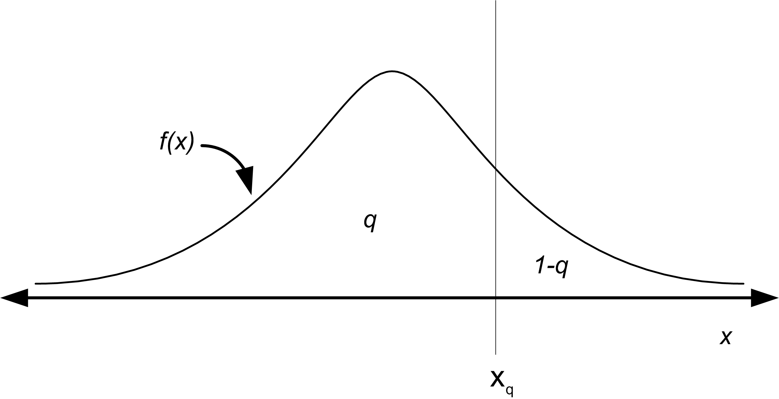
Figure B.14: The Quantile of a Distribution
For example, the z-values for the standard normal distribution tables are the quantiles of that distribution. The quantiles of a distribution are readily available if the inverse CDF of the distribution is available. Thus, the quantile can be defined as:
\[x_q = F^{-1}(q)\]
where \(F^{-1}\) represents the inverse of the cumulative distribution function (not the reciprocal). For example, if the hypothesized distribution is N(0,1) then 1.96 = \(\Phi^{-1}(0.975)\) so that \(x_{0.975}\) = 1.96 where \(\Phi(z)\) is the CDF of the standard normal distribution. When you give a probability to the inverse of the cumulative distribution function, you get back the corresponding ordinate value that is associated with the area under the curve, e.g. the quantile.
To make a Q-Q Plot, perform the following steps:
Sort the data to obtain the order statistics: \((x_{(1}, x_{(2)}, \ldots x_{(n)})\)
Compute \(q_i = \dfrac{i - 0.5}{n}\) for i= 1, 2, \(\ldots\) n
Compute \(x_{q_i} = \hat{F}^{-1} (q_i)\) for where i = 1, 2, \(\ldots\) n is the \(\hat{F}^{-1}\) inverse CDF of the hypothesized distribution
Plot \(x_{q_i}\) versus \(x_{(i)}\) for i = 1, 2, \(\ldots\) n
Thus, in order to make a P-P Plot, the CDF of the hypothesized distribution must be available and in order to make a Q-Q Plot, the inverse CDF of the hypothesized distribution must be available. When the inverse CDF is not readily available there are other methods to making Q-Q plots for many distributions. These methods are outlined in (Law 2007). The following example will illustrate how to make and interpret the P-P plot and Q-Q plot for the hypothesized gamma distribution for the task times.
The following R listing will make the P-P and Q-Q plots for this situation.
plot(Fj,ppoints(length(y))) # make P-P plot
abline(0,1) # add a reference line to the plot
qqplot(y, qgamma(ppoints(length(y)), shape = a, scale = b)) # make Q-Q Plot
abline(0,1) # add a reference line to the plot
The function ppoints() in R will generate \(\tilde{F}_n(x_{(i)})\). Then you can easily use the distribution function (with the “p,” as in pgamma()) to compute the theoretical probabilities. In R, the quantile function can be found by appending a “q” to the name of the available distributions. We have already seen qt() for the student-t distribution. For the normal, we use qnorm() and for the gamma, we use qgamma(). Search the R help for ‘distributions’ to find the other common distributions. The function abline() will add a reference line between 0 and 1 to the plot. Figure B.15 illustrates the P-P plot.

Figure B.15: The P-P Plot for the Task Times with gamma(shape = 3.56, scale = 3.76)
The Q-Q plot should appear approximately linear with intercept zero and slope 1, i.e. a 45 degree line, if there is a good fit to the data. In addition, curvature at the ends implies too long or too short tails, convex or concave curvature implies asymmetry, and stragglers at either ends may be outliers. The P-P Plot should also appear linear with intercept 0 and slope 1. The abline() function was used to add the reference line to the plots. Figure B.16 illustrates the Q-Q plot. As can be seen in the figures, both plots do not appear to show any significant departure from a straight line. Notice that the Q-Q plot is a little off in the right tail.

Figure B.16: The Q-Q Plot for the Task Times with gamma(shape = 3.56, scale = 3.76)
Now, that we have seen how to do the analysis ‘by hand,’ let’s see how easy it can be using the fitdistrplus package. Notice that the fitdist command will fit the parameters of the distribution.
library(fitdistrplus)
fy = fitdist(y, "gamma")
print(fy)
## Fitting of the distribution ' gamma ' by maximum likelihood
## Parameters:
## estimate Std. Error
## shape 3.4098479 0.46055722
## rate 0.2542252 0.03699365Then, the gofstat function does all the work to compute the chi-square goodness of fit, K-S test statistic, as well as other goodness of fit criteria. The results lead to the same conclusion that we had before: the gamma distribution is a good model for this data.
gfy = gofstat(fy)
print(gfy)
## Goodness-of-fit statistics
## 1-mle-gamma
## Kolmogorov-Smirnov statistic 0.04930008
## Cramer-von Mises statistic 0.03754480
## Anderson-Darling statistic 0.25485917
##
## Goodness-of-fit criteria
## 1-mle-gamma
## Akaike's Information Criterion 663.3157
## Bayesian Information Criterion 668.5260print(gfy$chisq) # chi-squared test statistic## [1] 3.544766print(gfy$chisqpvalue) # chi-squared p-value## [1] 0.8956877print(gfy$chisqdf) # chi-squared degrees of freedom## [1] 8Plotting the object returned from the fitdist command via (e.g. plot(fy)), produces a plot (Figure B.17) of the empirical and theoretical distributions, as well as the P-P and Q-Q plots.

Figure B.17: Distribution Plot from fitdistrplus for Gamma Distribution Fit of Computer Repair Times
Figure B.18 illustrates the P-P and Q-Q plots if we were to hypothesize a uniform distribution. Clearly, the plots in Figure B.18 illustrate that a uniform distribution is not a good model for the task times.

Figure B.18: Distribution Plot from fitdistrplus for Uniform Distribution Fit of Computer Repair Times
B.5.6 Using the Input Analyzer
In this section, we will use the Arena Input Analyzer to fit a distribution to service times collected for the pharmacy example. The Arena Input Analyzer is a separate program hat comes with Arena. It is available as part of the free student edition of Arena.
Let \(X_i\) be the service time of the \(i^{th}\) customer, where the service time is defined as starting when the \((i - 1)^{st}\) customer begins to drive off and ending when the \(i^{th}\) customer drives off after interacting with the pharmacist. In the case where there is no customer already in line when the \(i^{th}\) customer arrives, the start of the service can be defined as the point where the customer’s car arrives to the beginning of the space in front of the pharmacist’s window. Notice that in this definition, the time that it takes the car to pull up to the pharmacy window is being included. An alternative definition of service time might simply be the time between when the pharmacist asks the customer what they need until the time in which the customer gets the receipt. Both of these definitions are reasonable interpretations of service times and it is up to you to decide what sort of definition fits best with the overall modeling objectives. As you can see, input modeling is as much an art as it is a science.
One hundred observations of the service time were collected using a portable digital assistant and are shown in Table B.7 where the first observation is in row 1 column 1, the second observation is in row 2 column 1, the \(21^{st}\) observation is in row 1 column 2, and so forth. This data is available in the text file PharmacyInputModelingExampleData.txt that accompanies this chapter.
| 61 | 278.73 | 194.68 | 55.33 | 398.39 |
| 59.09 | 70.55 | 151.65 | 58.45 | 86.88 |
| 374.89 | 782.22 | 185.45 | 640.59 | 137.64 |
| 195.45 | 46.23 | 120.42 | 409.49 | 171.39 |
| 185.76 | 126.49 | 367.76 | 87.19 | 135.6 |
| 268.61 | 110.05 | 146.81 | 59 | 291.63 |
| 257.5 | 294.19 | 73.79 | 71.64 | 187.02 |
| 475.51 | 433.89 | 440.7 | 121.69 | 174.11 |
| 77.3 | 211.38 | 330.09 | 96.96 | 911.19 |
| 88.71 | 266.5 | 97.99 | 301.43 | 201.53 |
| 108.17 | 71.77 | 53.46 | 68.98 | 149.96 |
| 94.68 | 65.52 | 279.9 | 276.55 | 163.27 |
| 244.09 | 71.61 | 122.81 | 497.87 | 677.92 |
| 230.68 | 155.5 | 42.93 | 232.75 | 255.64 |
| 371.02 | 83.51 | 515.66 | 52.2 | 396.21 |
| 160.39 | 148.43 | 56.11 | 144.24 | 181.76 |
| 104.98 | 46.23 | 74.79 | 86.43 | 554.05 |
| 102.98 | 77.65 | 188.15 | 106.6 | 123.22 |
| 140.19 | 104.15 | 278.06 | 183.82 | 89.12 |
| 193.65 | 351.78 | 95.53 | 219.18 | 546.57 |
Prior to using the Input Analyzer, you should check the data if the observations are stationary (not dependent on time) and whether it is independent. We will leave that analysis as an exercise, since we have already illustrated the process using R in the previous sections.
After opening the Input Analyzer you should choose New from the File menu to start a new input analyzer data set. Then, using File \(>\) Data File \(>\) Use Existing, you can import the text file containing the data for analysis. The resulting import should leave the Input Analyzer looking like Figure B.19.
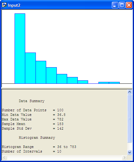
Figure B.19: Input Analyzer After Data Import
You should save the session, which will create a (.dft) file. Notice how the Input Analyzer automatically makes a histogram of the data and performs a basic statistical summary of the data. In looking at Figure B.19, we might hypothesize a distribution that has long tail to the right, such as the exponential distribution.
The Input Analyzer will fit many of the common distributions that are available within Arena: Beta, Erlang, Exponential, Gamma, Lognormal, Normal, Triangular, Uniform, Weibull, Empirical, Poisson. In addition, it will provide the expression to be used within the Arena model. The fitting process within the Input Analyzer is highly dependent upon the intervals that are chosen for the histogram of the data. Thus, it is very important that you vary the number of intervals and check the sensitivity of the fitting process to the number of intervals in the histogram.
There are two basic methods by which you can perform the fitting process 1) individually for a specific distribution and 2) by fitting all of the possible distributions. Given the interval specification the Input Analyzer will compute a Chi-Squared goodness of fit statistic, Kolmogorov-Smirnov Test, and squared error criteria, all of which will be discussed in what follows.
Let’s try to fit an exponential distribution to the observations. With the formerly imported data imported into an input window within the Input Analyzer, go to the Fit menu and select the exponential distribution. The resulting analysis is shown in the following listing.
Distribution Summary
Distribution:   Exponential
Expression: 36 + EXPO(147)
Square Error:   0.003955

Chi Square Test
Number of intervals = 4
Degrees of freedom  = 2
Test Statistic      = 2.01
Corresponding p-value   = 0.387

Kolmogorov-Smirnov Test
Test Statistic  = 0.0445
Corresponding p-value   > 0.15

Data Summary
Number of Data Points   = 100
Min Data Value          = 36.8
Max Data Value          = 782
Sample Mean             = 183
Sample Std Dev          = 142

Histogram Summary
Histogram Range     = 36 to 783
Number of Intervals = 10
The Input Analyzer has made a fit to the data and has recommended the Arena expression (36 + EXPO(147)). What is this value 36? The value 36 is called the offset or location parameter. The visual fit of the data is shown in Figure B.20
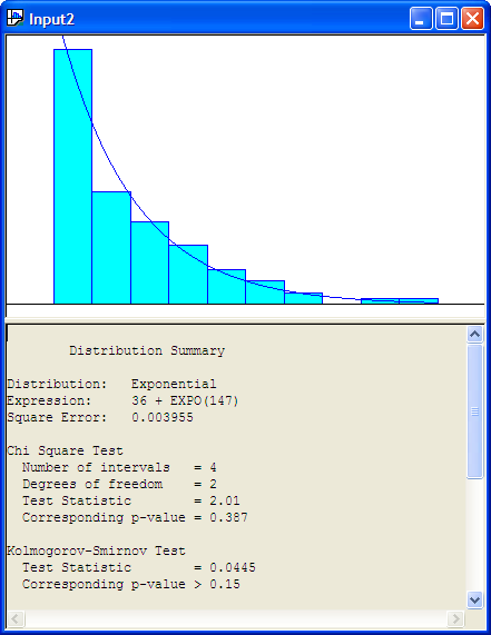
Figure B.20: Histogram for Exponential Fit to Service Times
Recall the discussion in Section A.2.4 concerning shifted distributions. Any distribution can have this additional parameter that shifts it along the x-axis. This can complicate parameter estimation procedures. The Input Analyzer has an algorithm which will attempt to estimate this parameter. Generally, a reasonable estimate of this parameter can be computed via the floor of the minimum observed value, \(\lfloor \min(x_i)\rfloor\). Is the model reasonable for the service time data? From the histogram with the exponential distribution overlaid, it appears to be a reasonable fit.
To understand the results of the fit, you must understand how to interpret the results from the Chi-Square Test and the Kolmogorov-Smirnov Test. The null hypothesis is that the data come from they hypothesized distribution versus the alternative hypothesis that the data do not come from the hypothesized distribution. The Input Analyzer shows the p-value of the tests.
The results of the distribution fitting process indicate that the p-value for the Chi-Square Test is 0.387. Thus, we would not reject the hypothesis that the service times come from the propose exponential distribution. For the K-S test, the p-value is greater than 0.15 which also does not suggest a serious lack of fit for the exponential distribution.
Figure B.21 show the results of fitting a uniform distribution to the data.
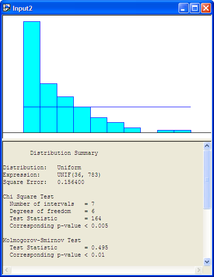
Figure B.21: Uniform Distribtuion and Histogram for Service Time Data
The following listing shows the results for the uniform distribution. The results show that the p-value for the K-S Test is smaller than 0.01, which indicates that the uniform distribution is probably not a good model for the service times.
Distribution Summary
Distribution:   Uniform
Expression: UNIF(36, 783)
Square Error:   0.156400

Chi Square Test
  Number of intervals   = 7
  Degrees of freedom    = 6
  Test Statistic        = 164
  Corresponding p-value < 0.005

Kolmogorov-Smirnov Test
  Test Statistic    = 0.495
  Corresponding p-value < 0.01

Data Summary
Number of Data Points   = 100
Min Data Value          = 36.8
Max Data Value          = 782
Sample Mean             = 183
Sample Std Dev          = 142

Histogram Summary
Histogram Range     = 36 to 783
Number of Intervals = 10
In general, you should be cautious of goodness-of-fit tests because they are unlikely to reject any distribution when you have little data, and they are likely to reject every distribution when you have lots of data. The point is, for whatever software that you use for your modeling fitting, you will need to correctly interpret the results of any statistical tests that are performed. Be sure to understand how these tests are computed and how sensitive the tests are to various assumptions within the model fitting process.
The final result of interest in the Input Analyzer’s distribution summary output is the value labeled Square Error. This is the criteria that the Input Analyzer uses to recommend a particular distribution when fitting multiple distributions at one time to the data. The squared error is defined as the sum over the intervals of the squared difference between the relative frequency and the probability associated with each interval:
\[\begin{equation} \text{Square Error} = \sum_{j = 1}^k (h_j - \hat{p}_j)^2 \tag{B.14} \end{equation}\]
Table B.8 shows the square error calculation for the fit of the exponential distribution to the service time data. The computed square error matches closely the value computed within the Input Analyzer, with the difference attributed to round off errors.
| \(j\) | \(c_j\) | \(b_j\) | \(h_j\) | \(\hat{p_j}\) | \((h_j - \hat{p_j})^2\) |
|---|---|---|---|---|---|
| 1 | 43 | 111 | 0.43 | 0.399 | 0.000961 |
| 2 | 19 | 185 | 0.19 | 0.24 | 0.0025 |
| 3 | 14 | 260 | 0.14 | 0.144 | 1.6E-05 |
| 4 | 10 | 335 | 0.1 | 0.0866 | 0.00018 |
| 5 | 6 | 410 | 0.06 | 0.0521 | 6.24E-05 |
| 6 | 4 | 484 | 0.04 | 0.0313 | 7.57E-05 |
| 7 | 2 | 559 | 0.02 | 0.0188 | 1.44E-06 |
| 8 | 0 | 634 | 0 | 0.0113 | 0.000128 |
| 9 | 1 | 708 | 0.01 | 0.0068 | 1.02E-05 |
| 10 | 1 | 783 | 0.01 | 0.00409 | 3.49E-05 |
| Square Error | 0.003969 |
When you select the Fit All option within the Input Analyzer, each of the possible distributions are fit in turn and the summary results computed. Then, the Input Analyzer ranks the distributions from smallest to largest according to the square error criteria. As you can see from the definition of the square error criteria, the metric is dependent upon the defining intervals. Thus, it is highly recommended that you test the sensitivity of the results to different values for the number of intervals.
Using the Fit All function results in the Input Analyzer suggesting that 36 + 747 * BETA(0.667, 2.73) expression is a good fit of the model (Figure B.22. The Window \(>\) Fit All Summary menu option will show the squared error criteria for all the distributions that were fit. Figure B.23 indicates that the Erlang distribution is second in the fitting process according to the squared error criteria and the Exponential distribution is third in the rankings. Since the Exponential distribution is a special case of the Erlang distribution we see that their squared error criteria is the same. Thus, in reality, these results reflect the same distribution.

Figure B.22: Fit All Beta Recommendation for Service Time Data
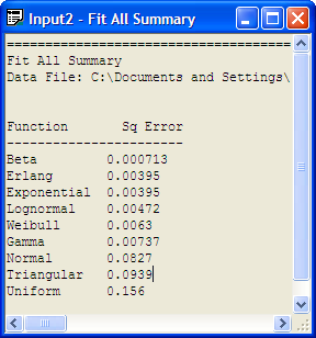
Figure B.23: Fit All Recommendation for Service Time Data
By using Options \(>\) Parameters \(>\) Histogram, the Histogram Parameters dialog can be used to change the parameters associated with the histogram as shown in Figure B.24.
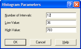
Figure B.24: Changing the Histogram Parameters
Changing the number of intervals to 12 results in the output provided in Figure B.25, which indicates that the exponential distribution is a reasonable model based on the Chi-Square test, the K-S test, and the squared error criteria. You are encouraged to check other fits with differing number of intervals. In most of the fits, the exponential distribution will be recommended. It is beginning to look like the exponential distribution is a reasonable model for the service time data.
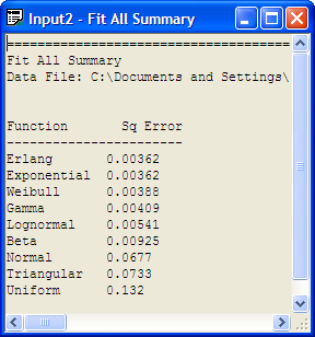
Figure B.25: Fit All with 12 Intervals
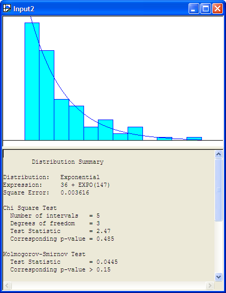
Figure B.26: Exponential Fit with 12 Intervals
The Input Analyzer is convenient because it has the fit all summary and will recommend a distribution. However, it does not provide P-P plots and Q-Q plots. To do this, we can use the fitdistrplus package within R. Before proceeding with this analysis, there is a technical issue that must be addressed.
The proposed model from the Input Analyzer is: 36 + EXPO(147). That is, if \(X\) is a random variable that represents the service time then \(X \sim 36\) + EXPO(147), where 147 is the mean of the exponential distribution, so that \(\lambda = 1/147\). Since 36 is a constant in this expression, this implies that the random variable \(W = X - 36\), has \(W \sim\) EXPO(147). Thus, the model checking versus the exponential distribution can be done on the random variable \(W\). That is, take the original data and subtract 36.
The following listing illustrates the R commands to make the fit, assuming that the data is in a file called ServiceTimes.txt within the R working directory. Figure B.27 shows that the exponential distribution is a good fit for the service times based on the empirical distribution, P-P plot, and the Q-Q plot.
x = scan(file="ServiceTimes.txt") #read in the file
Read 100 items
w=x-36
library(fitdistrplus)
Loading required package: survival
Loading required package: splines
fw = fitdist(w, "exp")
fw
Fitting of the distribution ' exp ' by maximum likelihood
Parameters:
        estimate   Std. Error
rate 0.006813019 0.0006662372
1/fw$estimate
    rate
146.7778
plot(fw)
Figure B.27: Distribution Plot from fitdistrplus for Service Time Data
The P-P and Q-Q plots of the shifted data indicate that the exponential distribution is an excellent fit for the service time data.